Project overviewFireAcad logo
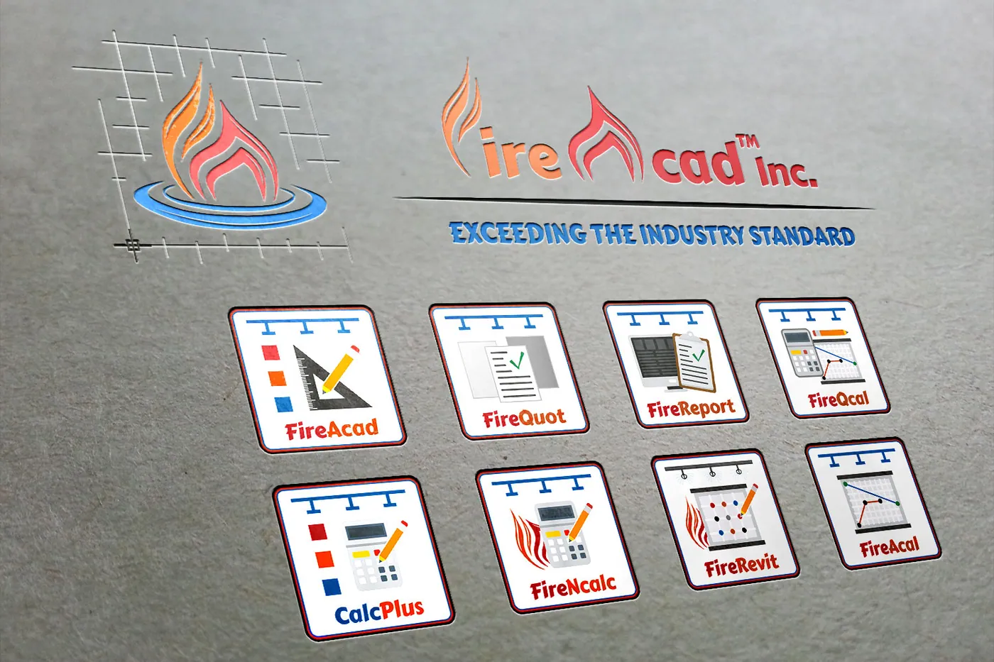
Along with a feature-packed new website, FireAcad asked us to redesign their logo. The final mark is an abstract “F” and “A” that fit together like puzzle pieces to form an orange and red flame, which is being put out by a blue ripple of water.
A grid in the background nods to the CAD nature of the software, and we designed matching icons for each product in their software suite.
What we did
- Logo redesign
- Product icon family
- Before-and-after brand refresh
Services used